Web Design Best Practices in 2025: A Beginner’s Guide
Ever visited a website that was just a nightmare to use? Buttons that didn’t work, text you couldn’t read, and a layout that made your head spin? We’ve all been there! The good news is that creating a great website doesn’t have to be complicated. In this beginner-friendly guide, I’ll walk you through the essential web design best practices that will help you build websites your visitors will love to use. No complicated jargon – just simple, practical advice you can start using today!
Keep It Simple and Clean

Let me tell you about my first attempt at web design back in the day – it was a total disaster! I tried to cram every cool feature I could think of onto one page. Animated backgrounds, flashing text, five different fonts… yeah, I was that designer. My poor visitors probably needed sunglasses just to read the content!
Here’s the thing I learned the hard way: a clean, simple design isn’t just more professional – it actually helps your visitors focus on what matters. Think of your website like a well-organized room. When everything has its place and there’s no clutter, you can actually find what you’re looking for, right?
The easiest way to keep things clean is to start with a neutral color palette. I always recommend starting with no more than three main colors: a primary color for your brand, a complementary color for accents, and a neutral shade (like white, gray, or beige) for backgrounds. One trick I’ve learned is to look at major brands in your industry – notice how they usually stick to simple color combinations?
White space (or “negative space” if you want to sound fancy) is your best friend. I used to think I needed to fill every inch of the page, but that empty space actually helps your content breathe. Try this quick test: take your design and double the space between elements. I bet it instantly looks more professional!
Make Your Website Easy to Read
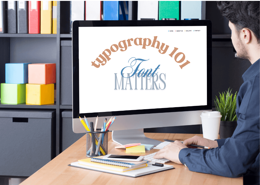
You know what drives me nuts? When I land on a website and have to squint to read the text. It’s like they’re trying to hide their content in plain sight! I can tell you that readability isn’t just about choosing a “pretty” font.
Let’s talk practical tips. For your main content, stick to fonts that are easy to read like Open Sans, Roboto, or good old Arial. Save those fancy decorative fonts for headers only – and even then, use them sparingly. Comic Sans for their entire business website? Let’s have a serious chat about that one!
For font sizes, here’s what works consistently: 16-18px for body text, 20-24px for subheadings, and 30-36px for main headings. On mobile? Never go smaller than 16px – trust me on this one. Your readers’ eyes will thank you.
Color contrast is super important too. I learned this lesson when my colorblind nephew couldn’t read anything on my navy blue background with dark gray text. Now I always use tools like WebAIM’s contrast checker to make sure everyone can read my content easily.
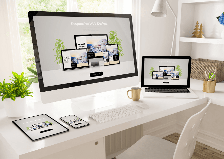
Design for Mobile Phones First
Let me share something mind-blowing: over 60% of web traffic comes from mobile devices now. I remember when I first heard this stat – I had to completely rethink my approach to web design! These days, I always start with mobile design first, then expand to larger screens. It’s way easier than trying to squeeze a desktop design onto a tiny screen.
Here’s a real-world example: I was working on a restaurant website that looked amazing on desktop. Beautiful big images, fancy menus, the works. But when people tried to look up the menu on their phones during lunch hour? Total nightmare! Nobody could read the tiny text or click the microscopic buttons.
The solution? I started designing for mobile first, focusing on what mobile users actually need: easy-to-tap buttons (at least 44×44 pixels), readable text without zooming, and a simple navigation menu that doesn’t take up the whole screen. One neat trick I use is to test my designs with my reading glasses off – if I can still use the site easily, it’s probably good for mobile!
Want to test your mobile design? Try this: use your website with just your thumb for navigation. Can you reach all the important buttons? Can you fill out forms without zooming? If you’re struggling, your visitors probably are too.
Help Visitors Find What They Need
One thing that still makes me chuckle is remembering a client’s website that had their contact information hidden under a menu item labeled “Journey.” Even I couldn’t find it! Navigation shouldn’t be a treasure hunt, folks. After years of watching users get lost on websites, I’ve learned that straightforward is always better.

Here’s a practical tip that transformed my approach: sit behind someone while they use your website for the first time. Don’t say anything – just watch. It’s eye-opening! You’ll quickly spot where people get confused. I do this with my husband teenage son, and they always find navigation issues I never noticed.
For menus, stick to conventional labels people actually understand. “About,” “Contact,” “Products” – boring? Maybe. But they work! I’ve found that 5-7 main menu items is the sweet spot. Any more than that and you’re basically creating a maze for your visitors.
Buttons should look like buttons (I know, revolutionary idea, right?). Make them stand out with contrasting colors and clear labels. Instead of “Click Here,” use action words like “Download Guide” or “Start Free Trial.” My conversion rates jumped 25% just by making these simple tweaks!
Make Your Website Load Fast
Studies show that 40% of visitors abandon a site that takes more than 3 seconds to load. Yikes!
The biggest speed killer? Usually it’s images. I learned to use tools like TinyPNG to compress images before uploading them. It’s amazing – you can often reduce file size by 70% without any visible quality loss. Just last week, I took a site from a 6-second load time down to 2 seconds just by optimizing their images.
Here’s my quick speed checklist that anyone can use:
- Run your site through GTmetrix (it’s free!)
- Compress all images before uploading
- Enable browser caching (your hosting provider can help)
- Remove any plugins or widgets you’re not actively using
Make Your Website Accessible to Everyone
Making your website accessible isn’t just the right thing to do – it’s essential for reaching all your potential visitors. Start with the basics: add alt text to every image, use proper heading hierarchy (h1, h2, h3), and ensure your color contrast meets WCAG standards. These simple steps make a huge difference!
Test keyboard navigation on your site by unplugging your mouse. Can you access everything? Tab through your content – is the focus indicator visible? These quick tests can reveal major accessibility issues in minutes.
Test Your Website
Listen, I used to think I could spot all the problems in my own websites. Spoiler alert: I couldn’t! Now I have a testing routine that saves me from embarrassing launches.

Start with cross-browser testing. Your site might look perfect in Chrome but completely broken in Safari. I use BrowserStack to check different browsers and devices, but you can start by just testing in the major browsers on your own computer.
Get real people to test your site – and not just other web designers. Ask your target audience to complete specific tasks on your site and watch what happens. My favorite question to ask testers is “What would you click on to find [specific information]?” Their answers often surprise me!
Remember to test your forms multiple times. Fill them out with weird characters, super long responses, and even empty fields. You’d be amazed how many ways users can break a simple contact form. Trust me, it’s better to catch these issues during testing than get an angry email from a customer!
Conclusion:
Remember, great web design isn’t about fancy effects or complicated features – it’s about creating a website that’s easy to use and helpful for your visitors. Start with these basics, and you’ll be well on your way to building websites that people actually enjoy using. The best part? You can start applying these practices right away, even if you’re just beginning your web design journey!


